As freelance UX/UI Designers, we were hired by a doctor to enhance his website, which he uses to showcase his expertise and attract patients. After discussing his goals and reviewing the existing site, we identified opportunities to improve usability and clarity.
Our team designed a new site focused on user experience, aiming to build visitor trust and increase patient conversions. We collaborated closely with the doctor to ensure the new design met both his needs and those of his patients.
Team
Matthias Karl Schaefle Leticia Magri
Scope of work
User research Wireframes UI design Prototyping
role
UX/UI Designer
year
2023 – 2024
Background
The doctor is a renowned plastic surgeon in São Paulo, Brazil, with 16 years of experience. Specializing in corrective body surgeries, his website showcases his expertise, attracts new patients, and provides detailed service information.
Problem
Confusing navigation, visually unpleasant design, and incomplete information
Upon evaluating the website, it was clear the navigation was confusing and the design visually unpleasant. Key areas lacked important information users wanted, as revealed in the research. This made it difficult for potential patients to connect with the doctor’s services.
My Role
I worked as a Product Designer, focusing on UX/UI, branding, and logo design. I participated in user research and collaborated with the team to create intuitive UI solutions.
Highlights
We proposed a user experience focused on usability, tailoring information to patient interests within a modern, responsive design. The visual design was updated for consistency, aiming to enhance efficiency and ensure a seamless experience.
Research
Exploring needs and perspectives
In our initial stakeholder interview, we focused on understanding the project’s objectives and gaining deeper insights into the doctor’s background.
The doctor wants to promote his innovative technique as a key attraction.
03
Blue Color on the Brand
It was emphasized to retain a blue tone, so we integrated it into the new design.
Understanding patient needs
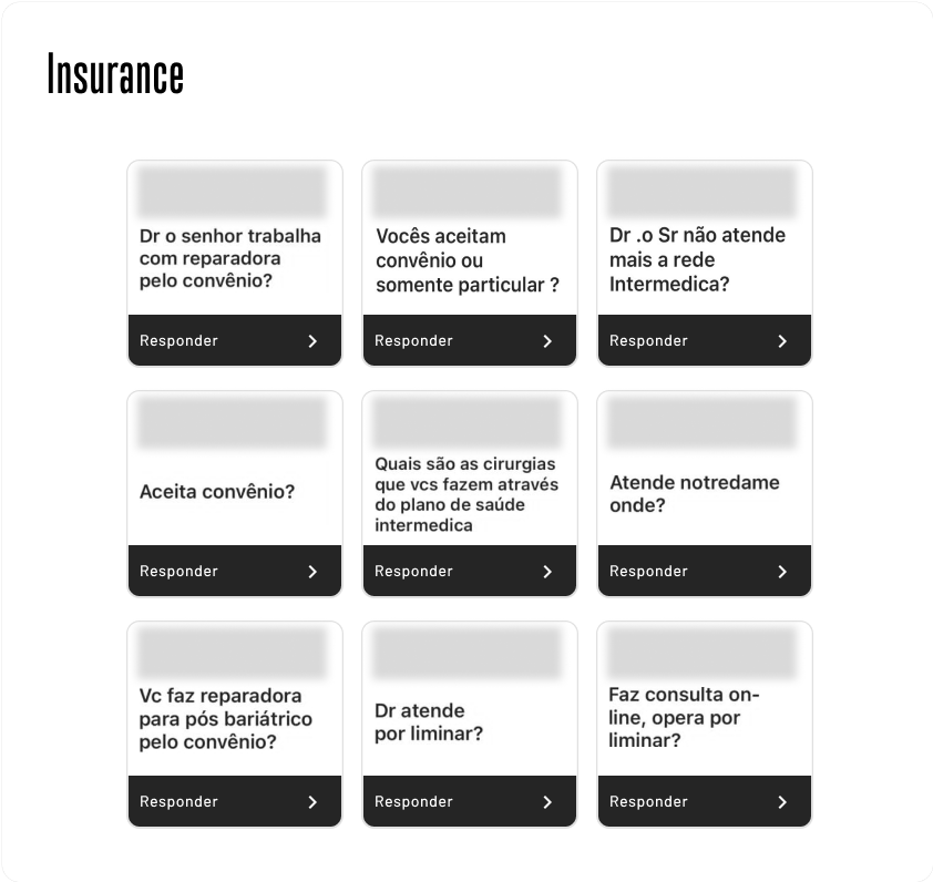
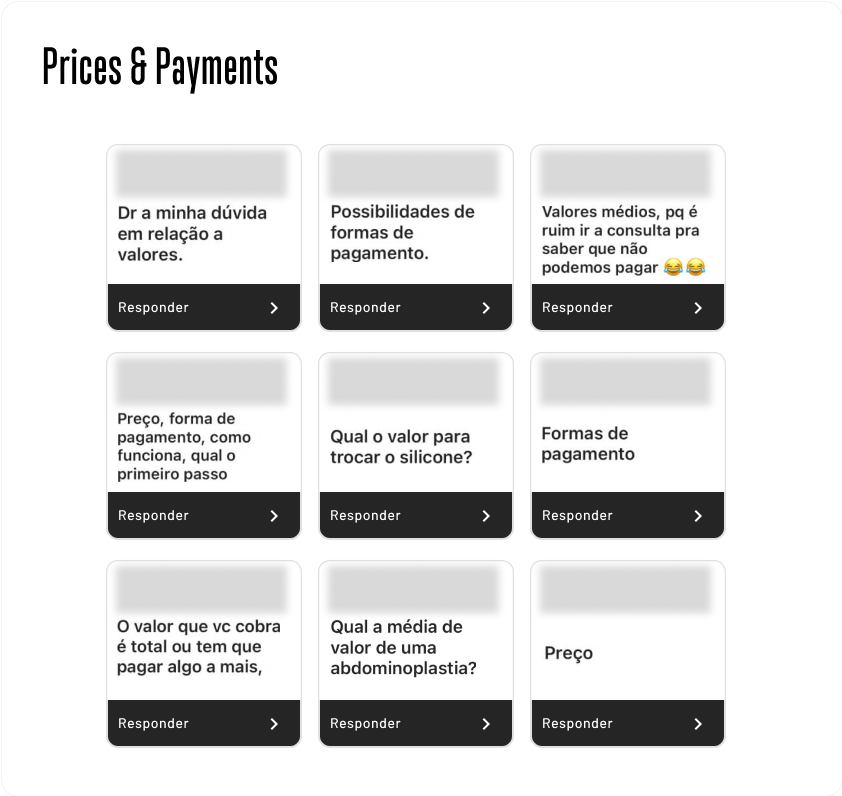
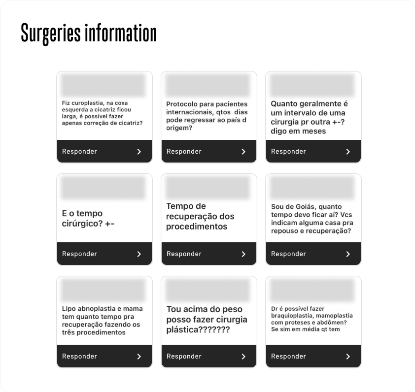
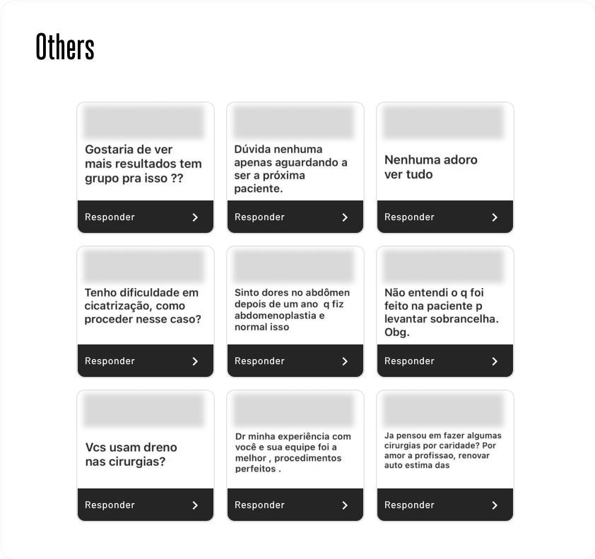
To better understand what patients really needed and expected, I conducted interviews with 5 patients and analyzed their most frequent questions.
Together with the social media and marketing team, we used Instagram question stickers to collect doubts in a more spontaneous and quick way. I then organized these questions into categories to make the analysis easier.
A selection of common questions from the Doctor's Instagram
These methods provided valuable insights, uncovering patterns and themes that guided key findings and design strategies.
01
Common Inquiries
Patients often have common questions about practical matters like insurance acceptance and payments. Making this information easily accessible is crucial for enhancing their experience.
02
Transparency and Feedback
Patients rely on photos and testimonials for clarity and insights, aiding them in making informed decisions about plastic surgery procedures.
Note: Until the handoff, the display of before and after photos was prohibited by law in Brazil.
03
Pre-Procedure Research
Before undergoing plastic surgery procedures, patients dedicate time to reading blogs and online posts to gather information about the entire surgical process.
Evaluation
Analyzing the current interface
I analyzed the current interface, focusing on the homepage, to identify opportunities to improve both user experience and design. I also validated research insights to ensure the redesign met patient needs.
View my comments by hovering over the dots
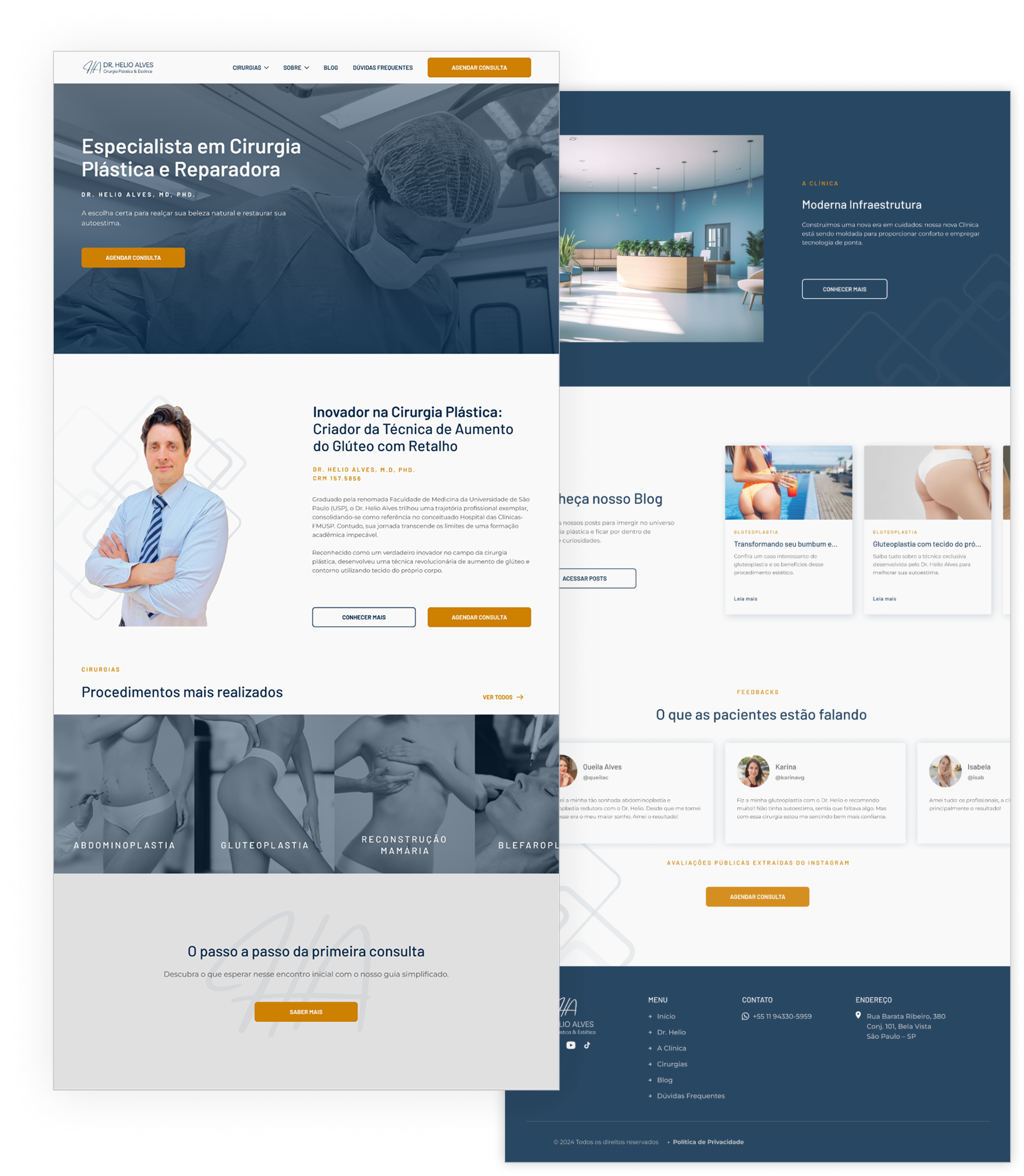
Maintaining the blog section is advisable, as our interviews indicate that patients often rely on this resource for information.
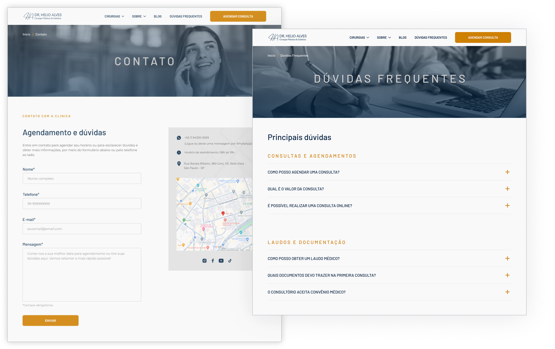
Including an FAQ section can be valuable for addressing common questions from prospective patients.
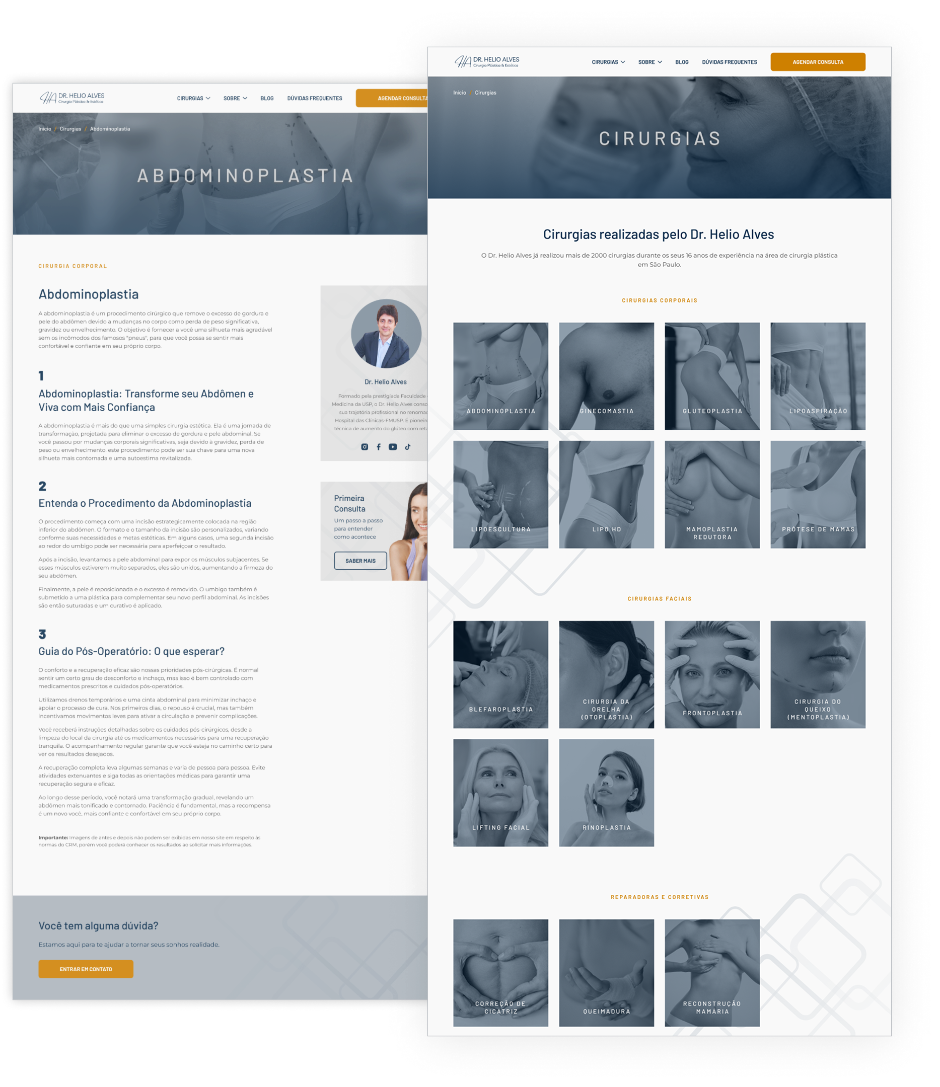
The list of surgeries could be clearer and better structured.
A grid system could be implemented, as the current site lacks consistency in layout.
Lack of emphasis on the doctor's specialization and technique.
Missing link to the page about the doctor. Adding this link builds trust and provides key information about the doctor's credentials.
Lack of contrast in fonts and inconsistency in blog boxes can be improved.
Absence of clinic address. Including this information can facilitate user location and enhance site credibility.
Unveiling ideas: Wireframes in action
From insights to design, wireframes shaped the final experience.
Wireframes
Some wireframe previews
Restructuring navigation
We redesigned the website’s information architecture to streamline navigation and help users quickly find their areas of interest.
information architecture
Style Guide
Streamlining design harmony
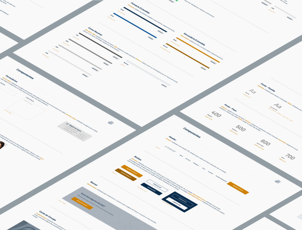
I crafted a structured style guide for seamless team reference and implementation, ensuring visual consistency and design efficiency.
A preview of our style guide
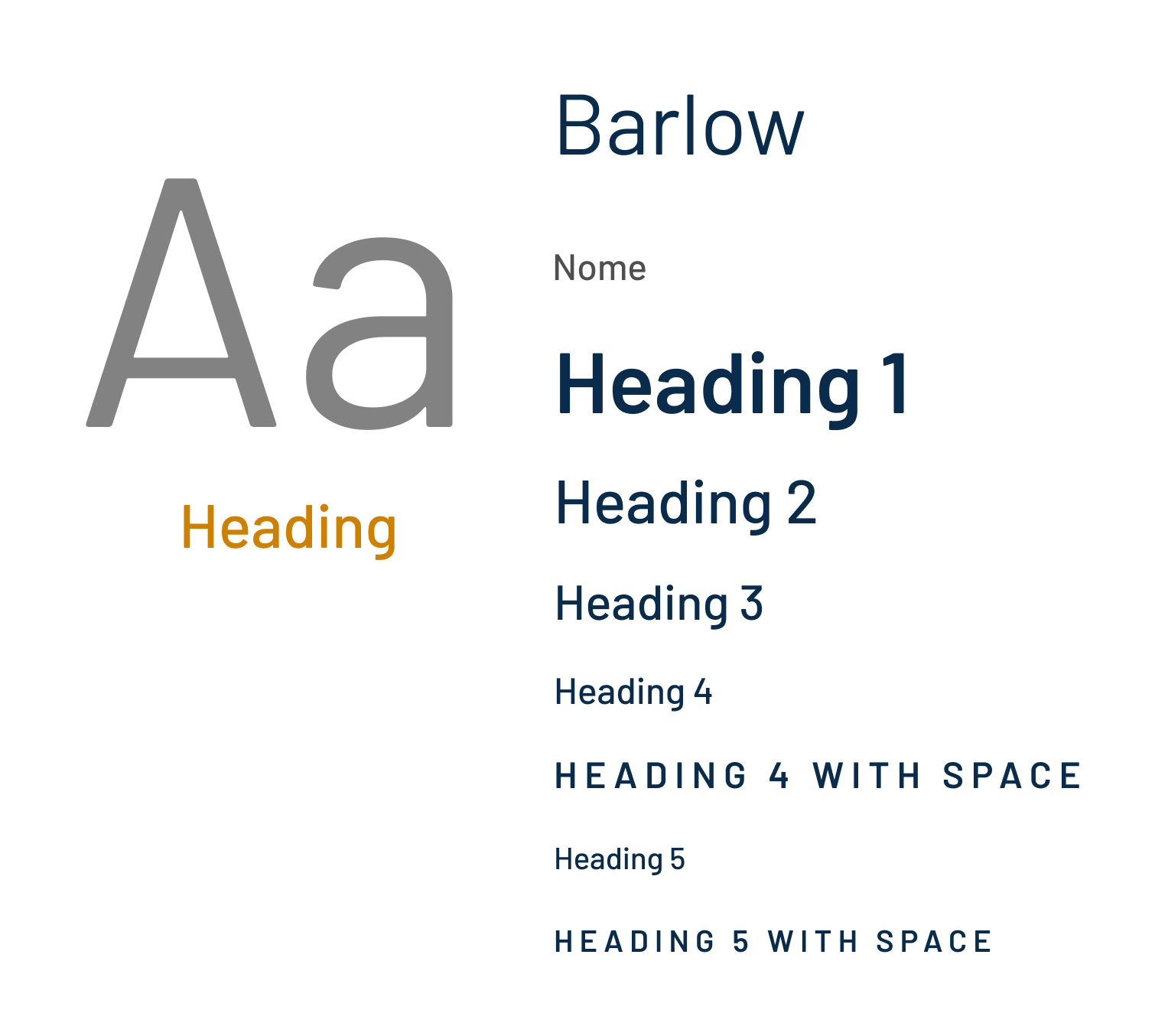
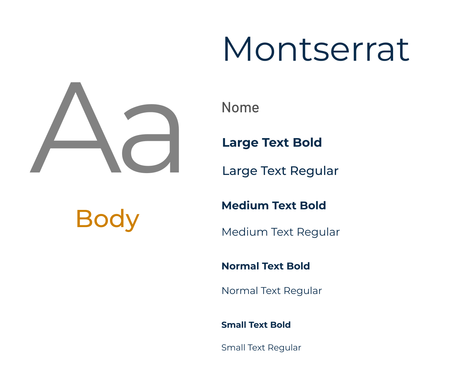
Typography
We chose Barlow for the header for its modern aesthetic and clean lines, and Montserrat for the body text for its legibility on various devices.
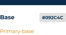
Colors
Blue, requested by the stakeholder, for trust and professionalism; gray for an elegant backdrop; and orange for dynamic contrast and attention.
Brand identity
I designed the logo to reflect the doctor’s essence and positioned it as a central element of the brand’s style guide.
Logotype
Logotype Header
Logotype Header
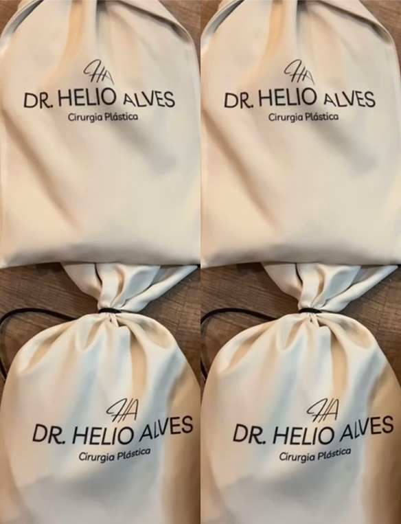
And it is already featured on physical items given to patients.
the redesign
Crafting Cohesive Experience
The redesign brought clarity to the navigation and resulted in a UX that is more fluid, reliable, and user-centered.
Please note that i am not responsible for implementing the website, and the current live version is not under my control.
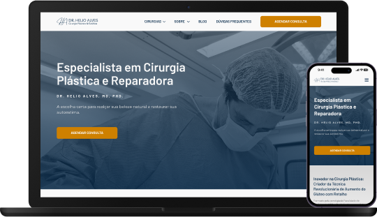
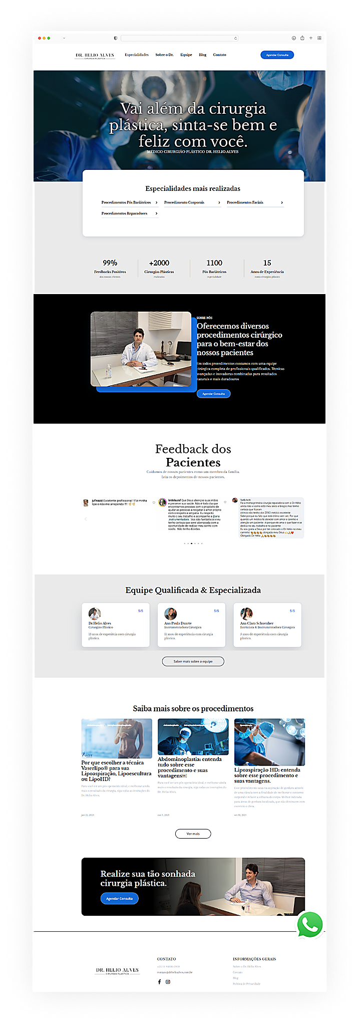
The homepage
I added the "learn more" button to allow users to discover more about the doctor and his innovative technique.
I added a homepage section with clear guidance on the initial consultation, based on patient insights from our interviews.
I chose to feature the most popular procedures on the homepage with photos to capture users' attention and make them easier to find.
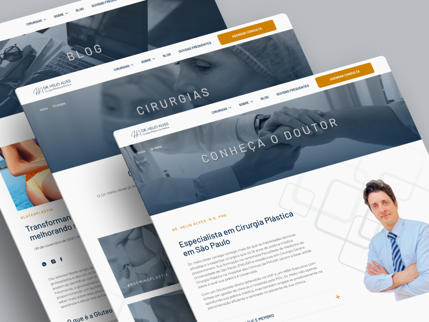
Subpages
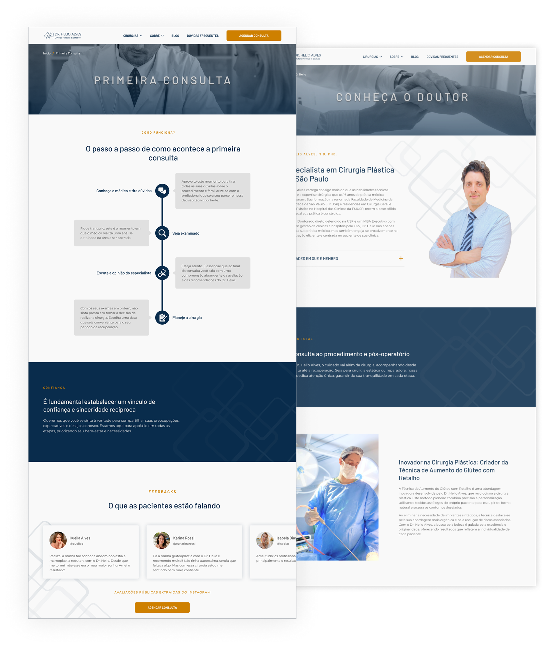
Implemented breadcrumbs for enhanced navigation.
I created a simple and easy-to-understand step-by- step guide, designed as a timeline, to streamline the first consultation process.
Enhanced explanation of the doctor's unique technique.
The entire FAQ page was informed by user research, addressing their actual questions and needs.
I organized the surgeries into categories with images to make them easier to identify, and future usability tests will validate this approach.
At the doctor’s request,
I highlighted the construction of the new clinic in a clear and easy-to-understand timeline.
Mobile version
Next steps
To ensure the website continues to meet user needs and stays updated with industry best practices, it’s essential not to stop here. We need to remain attentive to changes and continuous improvements.
01
Usability Test
The next step is to conduct usability tests to refine the site based on user feedback.
02
New Features
In the future, new features like a before-and-after page (once permitted) could showcase results and strengthen patient trust.
03
Performance Optimization
After implementation, it will be essential to monitor performance to ensure speed and smooth navigation.